HeNatal
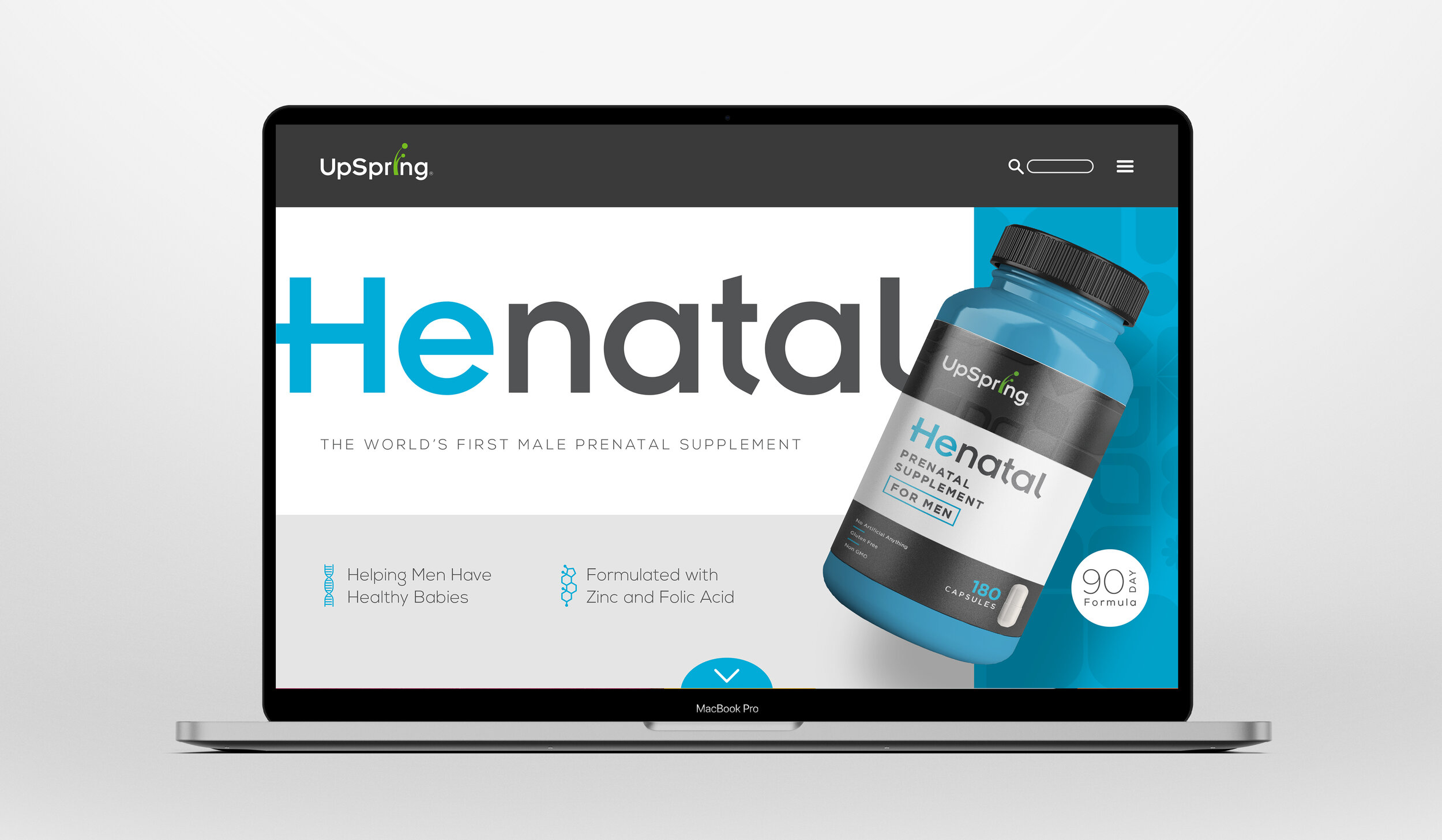
I was tasked with designing the packaging for a new male prenatal supplement for UpSpring. The challenge was that it needed to feel cohesive with their current line of products, but also appeal to a new demographic. How were they to reach a male audience for a product that had previously only been available to women? This packaging needed to retain the friendly nature of UpSpring’s brand, while bringing a touch of masculinity to appeal to this new audience.
Leveraging some of UpSpring’s existing patterns, I found a solution that felt familiar to the brand but more sophisticated and eye catching. In a category that is dominated by pastel colors, I chose to add a masculine edge using a bold dark grey complemented by a friendly bright blue. The pattern is accentuated against the dark gray with a spot varnish to provide a premium tactile element. The use of simple layout and geometric type gives a sense of scientific credibility to the consumer and adds a level of trust needed by a new product in the wellness category. This approach yielded a packaging that fit well among UpSpring’s other products while appealing to a completely new consumer.